Test- FTSE 100 Kicks Off August on a High as BP and Senior Lead Market Momentum
$11
10 Oct 2025, 13:13
Neutral
Understanding what the candles represent is an important factor to being able to interpret a chart correctly. Chart candles can often come in a variety of settings, however the most common is the candlestick. Other types include Heikin-Ashi, Line, Mountain and HLOC. In this article, we will cover each type of candlestick.
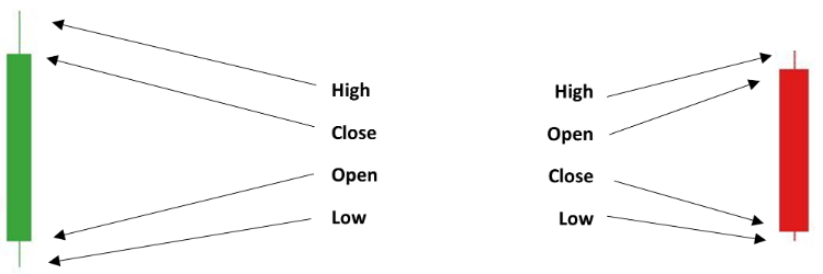
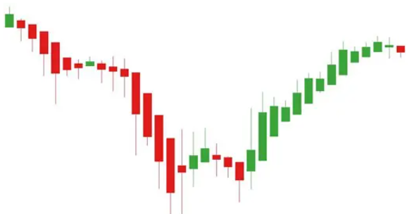
Candlesticks are the most common setting for chart analysis. As a default setting, they come in 3 colours – Red, Green and White. Though often platforms can allow you to change the colour of these to suit your personal preferences and they look like this:
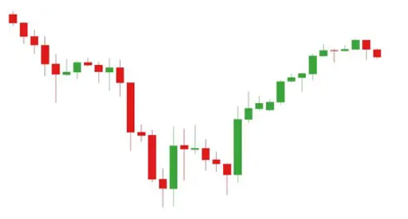
Each candlestick represents a time series on the chart. In this example above, each candlestick represents a 4-hour period and like this image below, every Candlestick has 4 main points of information, which make up its formula – Open-High-Low-Close (OHLC).
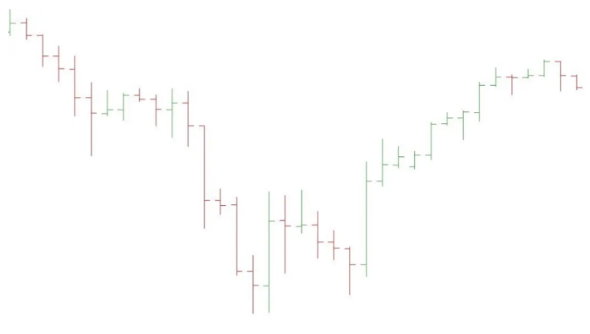
The Heikin-Ashi originates from Japan and means ‘average bar’ in Japanese. It shares very similar traits to candlestick charts however uses a slightly different formula for each timeframe. Unlike a Candlestick which uses an (OHLC), Heikin-Ashi candles use a formula called close-open-high-low (COHL). Quite often Heikin-Ashi candlesticks will stay red during a downturn in the markets and green in an uptrend within the market, whereas Candlesticks may alternate in colour regardless of the given trend.
These kinds of charts share the same properties as Candlestick charts. Each bar represents a timeframe and within that timeframe, a High, Close, Open and Low is recorded. Quite often these can be in colour but may also be displayed in grey.
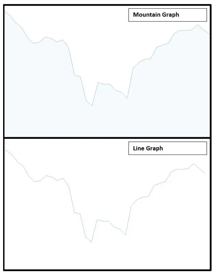
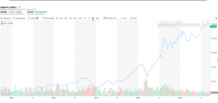
Line and mountain graphs look and work the same the only difference is a mountain chart is shaded below the price line. Both these kinds of charts are used across many websites to display prices to investors and traders. They are not complex and just simply show a direction based on the closing price of the day. Both Mountain and Line graphs can be a useful way to grasp a lot of information over a long period of time, however, they shouldn’t necessarily be relied on as they can give an illusion of greater growth than the actual reality. Popular sites such as Yahoo Finance and Trading View use Mountain and Line graphs as a standard display when viewing tickers, whereas more advanced sites and stockbrokers such as IG.com, use Candlesticks as a standard display.
With many chart settings available, traders & investors can become overwhelmed with information therefore picking the right chart setting is important. At Minipip our favourite chart setting is the candlestick chart as it displays enough information to make a fair judgement when placing a trade or investment.

Tradable assets:
CFDs, Spread Betting, Managed Portfolios, ISAs, Options
Rating:
FCA: